
Components
Alert Banner(Android)
Important account information displayed at the top of the application.
Usage
AlertBanner should be implemented as a global banner that displays at the top of the application. It is recommended to enforce a max height constraint to guard from the banner growing infinitely.
Content Guidelines
- should be non-dismissible until a required action is completed
- should have a link to resolve the required action
- should have a reasonable character count to avoid being partially shown with ellipsis
Themes
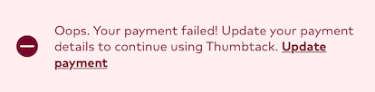
Caution

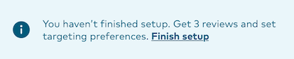
Info
Warning
Implementation
The name of the component is ThumbprintBanner. ThumbprintBanner contains three configurable attributes:
text: String. The main text to display in the banner. Configurable via properties or viaandroid:textin xml.linkText: String. Additional link text to display in the banner. Configurable via properties or viaapp:linkTextin xml.bannerTheme: Enum. This is one of three themes: INFO, WARNING, or CAUTION. This is configurable via properties by setting an enum of typeThumbprintBannerTypeor via xml using one of three options:app:bannerTheme="info",app:bannerTheme="warning"orapp:bannerTheme="caution".
Visibility
The global banner should always be visible at the top of the application other than exceptions where it may be intentionally hidden to provide the desired UX. Some situations where the global banner may not be visible could be:
- pre-login / signup
- fullscreen presentations
Refreshing
The global banner should refresh at predesignated triggers based on when the content may have changed, for example:
- application did start
- application did enter foreground
- main tab bar selection changed
Accessibility
AlertBanner responds to the device text size setting by omitting the icon when using the extra large text size. In the event that constraints limit the size of the banner, ellipsis are used in the middle of the text so that the action link is always visible at the end.