
Components
Button(Android)
Clickable elements used to perform actions.
Themes
A button can have one of five themes: Primary, Secondary, Tertiary, Caution and Solid.
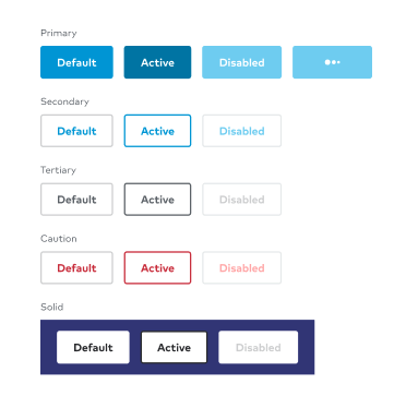
States
There are three global states: default, active and disabled. The primary button also has a loading state. All active states double as focus states.
Anatomy
Buttons contain one required element and one optional element.
- Background: Buttons are either a solid color or have a 2dp border. All buttons have a 4dp border radius.
- Content/CTA (required): Buttons should be sentence case with exceptions for proper nouns. Buttons should be limited to three words where possible.
- Icon (optional): An icon is used to emphasize an action.
Size
Only one button size is available on native. It adheres to our global tap target of 48dp.
Behavior
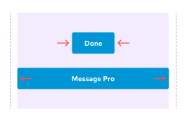
By default buttons change width depending on the content inside of them. Occasionally a design requires a button to span the width of the container. Full width buttons occupy 100% of the width available to them in the container.
Implementation
ThumbprintButton
Configurable items (via XML or values):
app:buttonTypein XML orThumbprintButton.buttonType, with enum valuesprimary,secondary,tertiary,caution, orsolid; defaults toprimaryandroid:textin XML orThumbprintButton.text, Stringapp:isEnabledin XML orThumbprintButton.isEnabled, Boolean; defaults to trueapp:isLoadingin XML orThumbprintButton.isLoading, Boolean; defaults to falseapp:isBleedin XML orThumbprintButton.isBleed, Boolean; defaults to falseapp:inlineDrawableLeftorapp:inlineDrawableRightin XML, Drawable