
Components
Button(iOS)
Clickable elements used to perform actions.
Summary
Button should be used to display buttons with text.
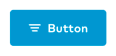
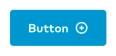
Buttons may also display an icon either to the leading or the trailing side, not both.
Theme
There are seven standard button themes on iOS. In addition, custom themes can be defined by calling the Button.Theme constructor directly.
Primary

Secondary

Tertiary

Caution

Solid

Text

Link

Size
There are three standard button sizes on iOS. Similarly to themes, custom sizes can be defined by calling the Button.Size constructor directly.
In tight layouts i.e. smaller screens or the user setting large fonts for display, the content may use up to 2/3 of the declared padding before being compressed or clipped.
Default
This is the size that should be used for the vast majority of buttons.

Small

Text
This size should be used with text-only themes like .text and .link, which do not have any background or border.
Accessibility
Set adjustsFontForContentSizeCategory: true to enable Dynamic Type support for a Button. Button titles will never wrap to more than one line, and resist increasing their text size beyond what will allow them to fit in the button.
Public API
Theme struct
public let titleColor: UIColor
public let activeTitleColor: UIColor
public let disabledTitleColor: UIColor
public let backgroundColor: UIColor?
public let activeBackgroundColor: UIColor?
public let disabledBackgroundColor: UIColor?
public let borderColor: UIColor?
public let activeBorderColor: UIColor?
public let disabledBorderColor: UIColor?
public let loaderTheme: LoaderDots.Theme?
public let supportsHapticFeedback: Bool
public init(titleColor: UIColor, activeTitleColor: UIColor, disabledTitleColor: UIColor, backgroundColor: UIColor?, activeBackgroundColor: UIColor?, disabledBackgroundColor: UIColor?, borderColor: UIColor?, activeBorderColor: UIColor?, disabledBorderColor: UIColor?, loaderTheme: LoaderDots.Theme?, supportsHapticFeedback: Bool)
public static let primary: Button.Theme
Primary button theme.
public static let secondary: Button.Theme
Secondary button theme.
public static let tertiary: Button.Theme
Tertiary button theme.
public static let caution: Button.Theme
Cautionary button theme.
public static let solid: Button.Theme
Solid white button theme. Only used on top of photos or “base colors” such as blue or indigo.
public static let text: Button.Theme
Text-only button theme.
public static let link: Button.Theme
Text-only button theme that appears as a link.
Size struct
public init(textStyle: Font.TextStyle, contentEdgeInsets: UIEdgeInsets = .zero, iconTextSpacing: CGFloat = Space.two)
public static func makeForText(textStyle: Font.TextStyle, contentEdgeInsets: UIEdgeInsets = .zero) -> Self
public static func height(for size: Size) -> CGFloat
public static let default: Button.Size
Default size should almost always be used.
public static let small: Button.Size
Small button size.
public static let text: Button.Size
Size that should be used with the .text/.link button themes.
Icon struct
enum Position
Options are leading and trailing, corresponding to the position of the icon against the label.
public let position: Position
Position of the icon, per the enum declared above.
public let image: UIImage
The image to use as an icon. It’s up to the caller to ensure it is the right size and has the right behavior.
public init(_ position: Position, image: UIImage)
Default initializer. Sets the properties.
public init?(_ position: Position, image: UIImage?)
Utility initializer to avoid repeated glue code when dealing with image sources that don’t commit to returning an image.
Button
public var theme: Button.Theme
Button theme.
public var size: Button.Size
Button size.
public var title: String?
Title of the button. Should always be an actual, non-empty string but many of our sources (i.e. graphQL) give us optionals and it would be far too inconvenient to protect against a potential nil value in every single case.
public var icon: Button.Icon?
A struct (see above) determining, if present, what icon to show and on what side of the label.
button.icon = .init(.leading, iconLeft)
button.icon = .init(.trailing, iconRight)
public var isLoading: Bool
A Boolean value indicating whether the button is in the loading state. Should only be used with button themes which have a non-nil loaderTheme.

public var adjustsFontSizeToFitWidth: Bool
A Boolean value indicating whether the font size should be reduced in order to fit the title string into the button title’s bounding rectangle. Defaults to the same value passed into the constructor for adjustsFontForContentSizeCategory.
public var minimumScaleFactor: CGFloat
The minimum scale factor supported for the button title’s text.
public var isHapticFeedbackEnabled: Bool
A Boolean value indicating whether haptic feedback is enabled on tap. Should only be used with the primary and secondary button themes.