Components
Button
Clickable elements used to perform actions.
TPButton
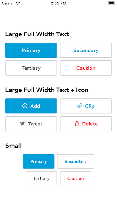
Displays a button with text and optionally an icon. By default, TPButtons are rendered with a large primary theme.
Examples
// Default TPButtonTPButton(title: "Primary", action: { doSomething() })

// Large, full width, tertiary buttonTPButton(title: "Demo", action: { doSomething() }).tpButtonTheme(.tertiary(fullWidth: true))

// Row of three equal width primary buttonsHStack {TPButton(title: "Button1", action: {})TPButton(title: "Button2", action: {})}.tpButtonTheme(.primary(fullWidth: true))
TPButton.Theme
TPButtons are styled by setting a TPButton.Theme with the the tpButtonTheme(_: TPButton.Theme) extension on View. tpButtonTheme will pass the theme to any TPButtons within the View on which it is called by way of an environment variable.
TPButton.Theme defines both style (color and font) as well size and whether the button should expand. To the full width of its container. There are convenience initializers for each theme (.primary, .secondary, .tertiary, or .caution), to which one may pass overrides for size and isFullWidth.

TPRightIconButton (Thumbprint Extension)
Buttons with text on the left and an icon on the right are not technically part of the Thumbprint design system yet, though they do appear in the app from time to time. To support these buttons as well as to style them in a consistent manner, TPRightIconButton exists as a Thumbprint extension.
TPRightIconButton supports the exact same themes as TTButton, and is styled in exactly the same manner. The only difference between the two is that TPRightIconButton places the icon to the right of the text.
Example
TPRightIconButton(title: "Add", icon: Icon.contentActionsAddMedium, action: {})
![]()
TPIconButton
TPIconButton defines a button that looks just like one of the Thumbprint icons. TPIconButton’s are styled with a TPIconButtonTheme (either default, for which renders the button with dark colors for display on a light background; or dark, which renders the button with light colors for display on a dark background). TPIconButtonTheme does not have a size parameter because the button always displays at the size of the icon with which is was initialized.
Examples
// IconButton displaying a medium folder icon with default colorsTPIconButton(icon: .contentActionsFolderMedium, action: { doSomething() })
![]()
// IconButtons displaying a small star and a small mail icon, both against a dark backgroundHStack {TPIconButton(icon: .inputsStarSmall, action: {})TPIconButton(icon: .featureMailSmall, action: {})}.tpIconButtonTheme(.dark).padding().background(Color.tpBlack)
![]()