Components
Button(Usage)
Clickable elements used to perform actions.
Usage
The Button (commonly referred to as call-to-actions or CTA) component enables users to perform actions within the page, such as submitting form data or activating sharing utilities. Buttons are also offered in many styles to provide a visual hierarchy of intended use.
Anatomy
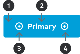
1
Surface
Colored surface used as backdrop for the Label and Icon (optional) messaging.2
Label
Succinct text that supports a contextual messaging. Text color should match the Icon color and should coordinate with the Background hue.3
Icon / Left
Visual support for Label messaging. Most commonly used position. Should not be used in conjunction with Icon / Right.3
Icon / Right
Visual support for Label messaging. Typically used a directional indicator. Should not be used in conjunction with Icon / Left.
Specs
Component details and standards such as spacing, sizing, and color.
Spacing
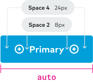
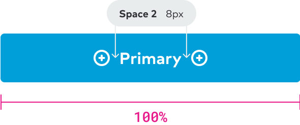
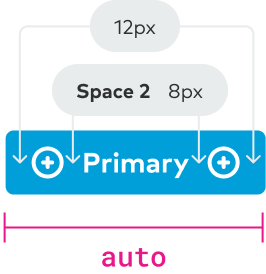
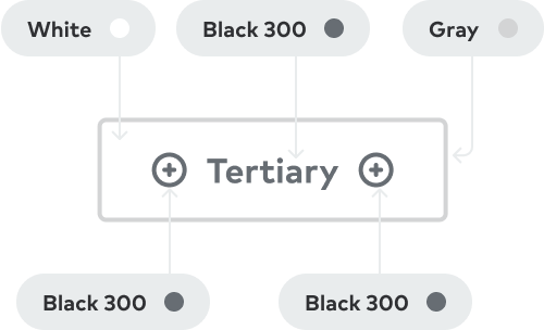
There are two button sizes, Large and Small. Almost always, the Large size should be used. Tertiary buttons should mostly be used in the Small size, and Tertiary may not be used at the Large size.
Large
Small
Sizing
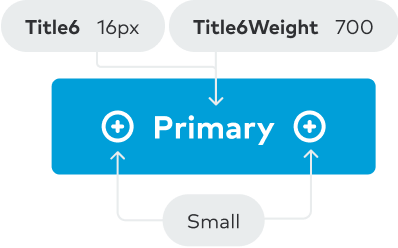
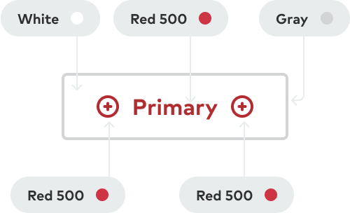
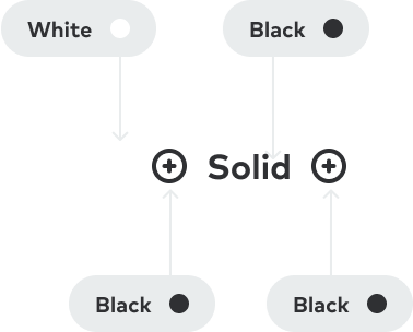
Color
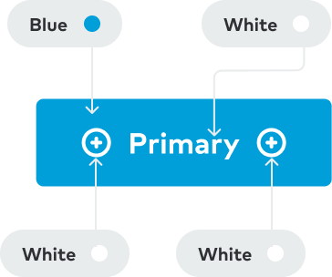
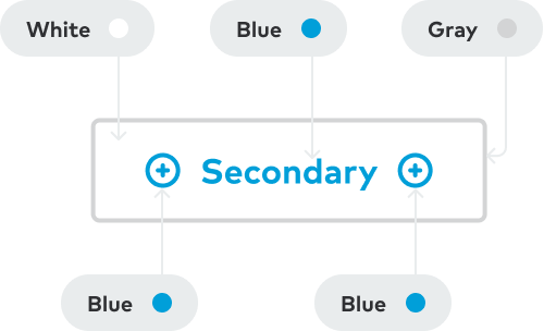
Buttons are offered in four variations: Primary, Secondary, Tertiary and Caution. Each variation includes a set color scheme that provides the appropriate emphasis based on the intended use case.
Primary
Secondary
Tertiary
Caution
Solid
Best practices
Below is a list of examples of how CTAs should/shouldn’t be used through visual representations of our Do’s and Dont’s.

Place the Primary CTA in the top position when buttons are stacked vertically.
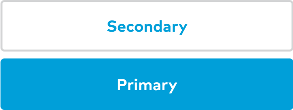
Place the Primary CTA under any other CTA option.

Use iconography provided by Thumbprint for the left / right icons.

Do not use external images, iconography, or emojis.
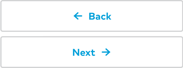
Use icons intentionally and responsibly. Icons should provide immediate and relative support to the experience.
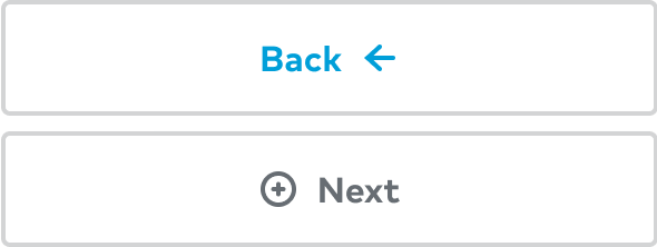
Use iconography that can be misleading or does not provide additional context.

Use the spacing and sizing provided by the component.

Make sizing adjustments for buttons to fit particular circumstances.
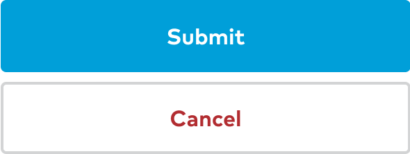
Use colors provided by the variant options determined by the button theme.
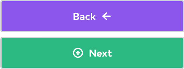
Adjust CTA colors to fit a particular context.
Accessibility
- Be sure text has a contrast ratio of at least 4.5:1 for small text and at least - 3:1 for large text (WCAG 2.0 1.4.3).
- Color should not be used exclusively to convey information.
- Text sizes should be scalable.
- Buttons should be accessible via keyboard interactions.
- Image-only buttons and links need alt-text.
- Use buttons for primary actions and links for navigation.
Content design
- Buttons should be 4 words or less.
- Write in sentence case, except for proper nouns (like the Thumbtack Guarantee).
- Do not use punctuation.
- Provide alt text for image-only buttons.
Learn more about writing for buttons, CTAs, and links in Surfaces and Elements.
Related components
- Button Row - Consistent spacing between buttons.
- Link - Color and style variations for anchor links.
- FAB - Buttons providing easy access to important actions.
- Chip - Compact controls that allow for toggling and filtering.