Components
Pill(Android)
Small labels that help qualify information.
Usage
Pills are compact badges that help to explain or draw attention to a certain area of the UI. Pills include one or both of text and an icon (which is aligned at the start of the text if both are present).
Themes
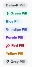
Android supports seven standard pill themes, shown below.

These themes correspond to the following colors:
- green
- blue
- indigo
- purple
- red
- yellow
- gray (the default)
Size
Pill uses Thumbprint Title7 text (14sp)
Layout XML
Pill instances are configured in layout XML, using the custom attributes
pillColorone of the seven colors determining the stylepillTexttext to usepillIconan optional icon
For example:
<com.thumbtack.thumbprint.views.pill.ThumbprintPillandroid:id="@+id/indigoPill"android:layout_width="wrap_content"android:layout_height="wrap_content"app:pillColor="indigo"app:pillText="Indigo Pill"app:pillIcon="@drawable/pill_icon" />
These attributes can also be modified programatically using the fields of the same name on the ThumbprintPill object.