
Components
Pill(iOS)
Small labels that help qualify information.
Usage
Pills are badges that help to explain or draw attention to a certain area of the UI. Often used to qualify leads or label inbox elements. Pills can accomodate one small icon.
Theme
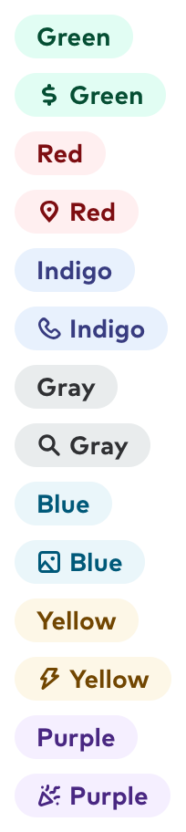
There are seven standard pill themes on iOS. In addition, custom themes can be defined by calling the Pill.Theme constructor directly. The standard pill themes also use title7 for the title font.
Accessibility
Set adjustsFontForContentSizeCategory: true to enable Dynamic Type support for a Pill. Pill titles will never wrap to more than one line, and resist increasing their text size beyond what will allow them to fit in the button. If circumstances still don’t allow for the full pill title to display, the title will first take out up to all the width of the pill and if that still isn’t enough it will truncate at the end.
For visually impaired navigation the pill is just represented by its title label.
Public API
Theme struct
public let backgroundColor: UIColor
public let contentColor: UIColor
public let name: String?
Used by some old legacy logic that stores it. Consider it deprecated.
public static let green: Pill.Theme
The standard green pill theme.
public static let blue: Pill.Theme
The standard blue pill theme.
public static let red: Pill.Theme
The standard red pill theme.
public static let indigo: Pill.Theme
The standard indigo pill theme.
public static let gray: Pill.Theme
The standard gray pill theme. Also used as a fallback default if no theme can be found to apply to a pill.
public static let yellow: Pill.Theme
The standard yellow pill theme.
public static let purple: Pill.Theme
The standard purple pill theme.
Pill
public var image: UIImage?
If present will always show on the leading side. Should always be a tiny sized icon.
public var text: String?
While an optional, should always be set to a non-empty string before display.